For Christmas I made a portrait of my daughter, Anastasia and her fiance David.

Stashi's face I knew pretty well because I use to draw her when she was young but David's features were new to me and I had to learn to draw his face.
I did some preliminary sketches to get a feel for their faces and to decide what I wanted.
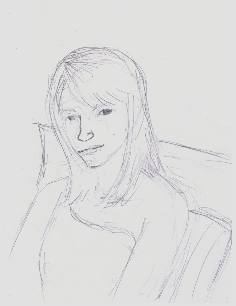
Though I use to draw Stashi I had to become familiar with it as it is now, as a woman's face. Her beautiful big black eyes are the same but her chin has grown and her face has elongated.
I want to show her relaxed butr with a slight Mona Lisa smile. I'm really happy with this sketch and wish the rest of them came out as good but as an artist I've learned to make my best effort and except what I get.

I'm not familiar with David's face at all so I need to study his features. I really love his big smile in the picture above where he proposes to Stashi so I try to capture that. It proves harder than I thought and the first sketch looks more like a caricature than a portrait. I wanted to capture his smiling eyes and excited smile but instead got a clownish caricature. Sorry David and Stash. This picture is not at all a comment on your good looks but just a terribly distorted drawing and testament to my lack of ability. But again, I work with what I get.

I drew the two of them together. I wanted to make two portraits but have them displayed together. I drew them in such a way so that they look like they could be holding hands off panel. The background objects are distortions of the chairs they are sitting on. I used the shape to create a dynamic composition and the red upholstery for color.
I took the opportunity to do David's face again and it looks much better.

The original photo has a warm reddish or golden brown for the background but I really want to user a blue green or turquoise. Call it artistic license.
I really like Stashi's hair here and this composition may be the most successful.

I got the colors that I like together and made a first rough draft to see how it comes out. I enjoyed the muted colors here unfortunately the red of the upholstery doesn't show very well in this scan. I wanted to make the colors flat (no shading) and roughly applied while the black lines don't follow the shapes of color but rather define the images. I wanted to make them as realistic (in pen and ink) as possible though, again, I accept what I get. I need to tone down the mouth.

Over all, this is pretty nice. I love the splash of red of the upholstery though I'd like the dress to be a little more tame.

In the end I attempted to apply the colors as roughly as possible. I quickly brushed them on with a minimum of thinking or planing, trusting my intuition and previous practice efforts. I approach this work more as a performance that I practice for than a visual image that I work on till I'm satisfied. It's way too easy to kill a painting by overworking it so I plan it out with numerous versions before I hit upon the final version. There are two other versions I haven't shown here.
David's face has been really hard to capture but I think this is good enough.

What I finally do of Stashi looks more like her as a child than an adult but I don't mind. She is beautiful either way.
No comments:
Post a Comment